In August, Domino's paid customers to beta test its redesigned app — months after it went live.
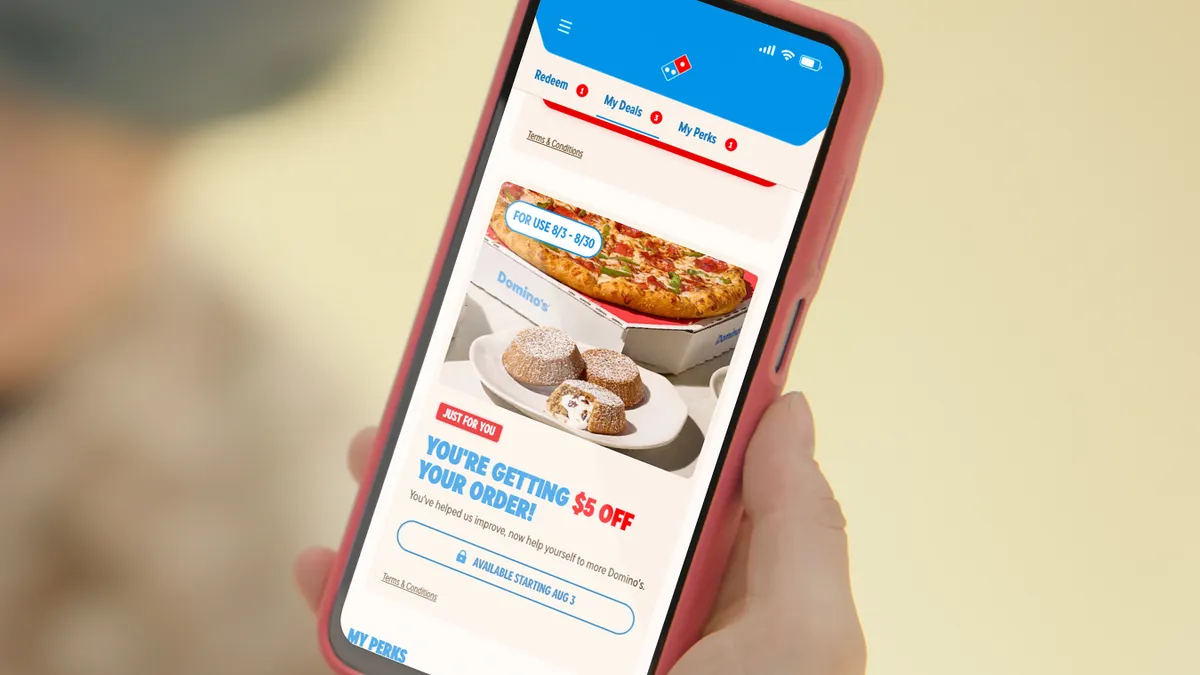
In exchange for feedback on the ordering experience, any customer who placed a qualifying online order between Aug. 3 and Aug. 30 received a $5 off coupon for the following week.
The move came months after the launch of the redesigned app and website, which had done more to alienate customers than win them over. Based on Reddit threads and app store reviews, the complaints are wide-ranging. Reordering past favorites takes more taps and scrolling than before, and oversized layout elements require excessive scrolling to view basic order summaries.
On top of that, details like carside pickup information and delivery notes frequently fail to save, and users report login drops, slow loading and intermittent crashes.
The situation echoes other high-profile redesign missteps like Sonos' botched app overhaul, and points to a broader lesson: Full-scale redesigns are increasingly out of step with how leading brands manage digital experiences.
“The best approach is to always be investing in your app so that it never feels stale or starts to fall behind user preferences or changes in the business model,” said Brad Jashinsky, director analyst at Gartner.
For brands that do undertake a larger redesign, Soren Iverson, founder of creative consultancy Iverson, recommended a phased rollout with feature flags and do-no-harm benchmarks, rolling the app out to 1% of users at a time and measuring performance rather than "ripping the band-aid off all at once."
Domino's did not respond to a request for comment.
Built for browsing, not ordering
The redesign is visually polished but treats ordering pizza like browsing an online store.
The first thing that stood out in walking through the app's onboarding, menu browsing and cart flow was the discrepancy in information density compared to competitors like DoorDash, McDonald's and Starbucks, said Iverson.
On Domino's pizza detail pages, users see “almost a full bleed image of a pizza,” Iverson said. In contrast, DoorDash's product pages show review counts, previous order history and one-click re-add to cart.
“The first thing that really stuck out to me is it feels very editorial and almost like e-commerce,” Iverson said. “When you look at a lot of mobile ordering experiences for food, it is often much more information dense and focused.”
The app also opens with a large, looping video of a pizza.
“When I open a food delivery app, I am usually there to place an order,” Sophie Kuzmina, head of creative studio and CX specialist at InAppStory, said in an email. “I would rather get straight to the menu.”
For returning customers, the video is even more intrusive. “As a returning user, once you're signed in, it's pretty heavy-handed,” Iverson said. “My primary action would be placing an order, not watching something.”
The app should differentiate between first-time customers who need orientation and returning ones who just want to order quickly. But when Kuzmina used the app as a registered user, the only difference she noticed was a “welcome back” message.
“Otherwise, the communication did not feel significantly different,” Kuzmina said.
A case study in what not to do
A common thread in app redesign failures is excluding CX professionals from the planning process, leaving the people responsible for customer experience with little control over it.
CX professionals need to be in the room from the start, advocating for the customer's experience rather than letting the project be driven by intuition and business objectives, Iverson said.
“It's a tricky thing but an important thing to make sure that the customer is being listened to and heard and advocated for,” Iverson said.
Customer research should span the full spectrum of users, from first-time customers to the most loyal, Jashinsky said. But even when brands do sufficient research, they often underfund alpha and beta testing and bring in the right stakeholders too late.
The loss of saved data and removed functionality — a top complaint among Domino's users — is one of the riskiest aspects of any redesign, Iverson said. Brands should think carefully before adding features because removing a feature later carries both technical costs and the risk of alienating users.
"It's easier to add than it is to remove," Iverson said.
Iverson recommended that, in addition to evaluating the financial cost of adding or removing functionality, brands identify what percentage of customers will be impacted and how significantly.
Organizations should also decide how much disruption and frustration are acceptable, Iverson said, and communicate feature sunsets 30 to 60 days in advance rather than stripping features away in a redesign.
"Keep ordering clear and fast, and use separate communication formats when there is something useful to tell the customer," Kuzmina said.
Domino's, for its part, has framed the promotion as a customer-first initiative, though customers who used the app before August didn't get paid for their feedback.
"While other companies treat consumers like guinea pigs and ask them to test their sites and provide feedback for free, Domino's is paying customers to try its new digital ordering experience," the company said in an August press release.